Branding and Packaging
for Monken Hadley Brewery.
Concept Design, Retouch and Packaging for Capcom.
_
2020
2016 - 2018 WTF Creative
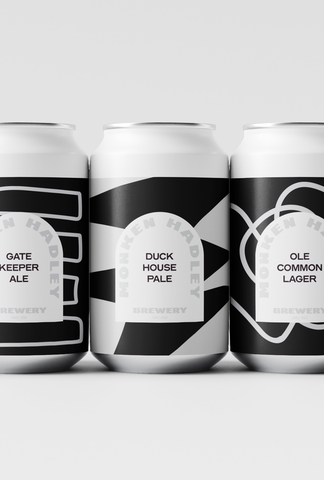
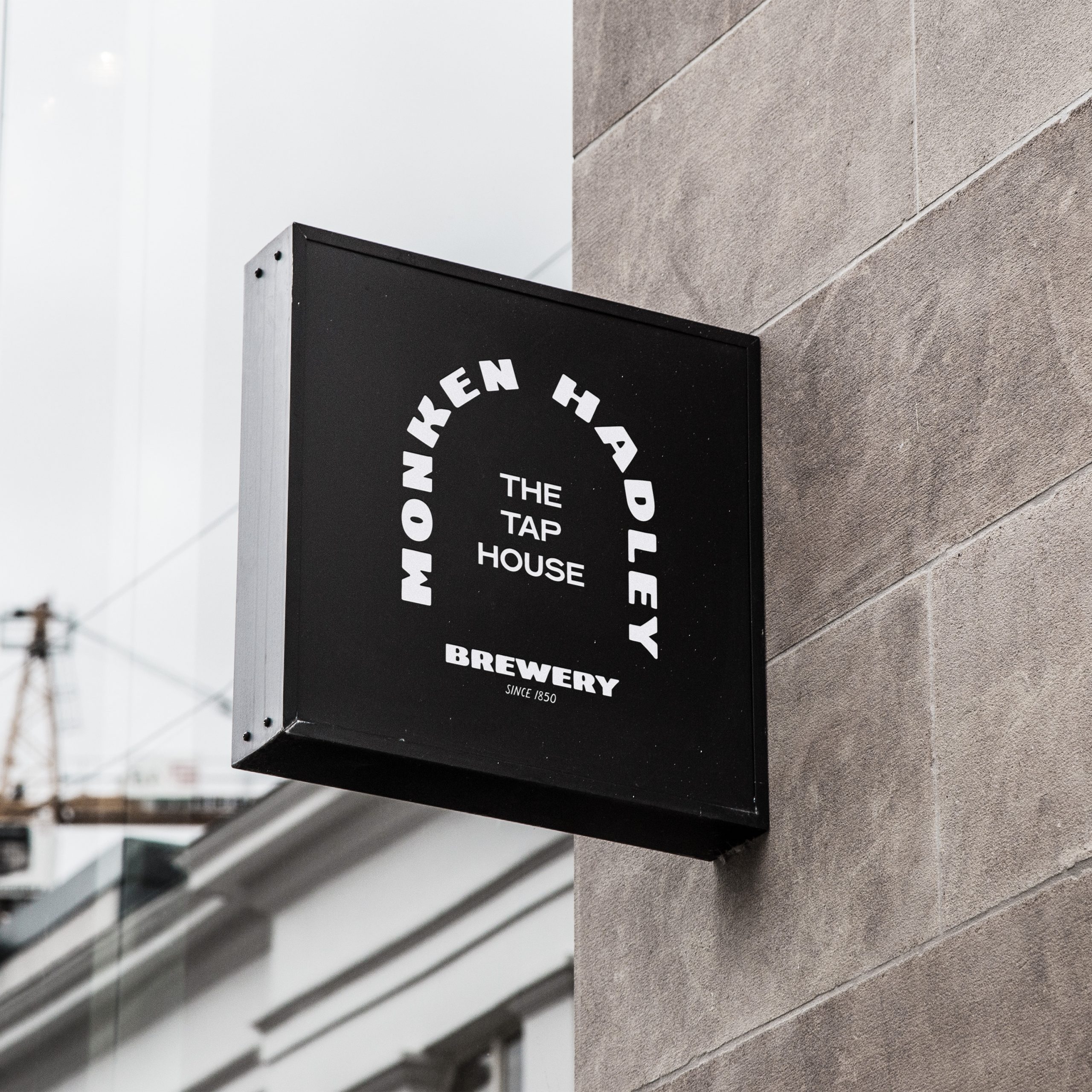
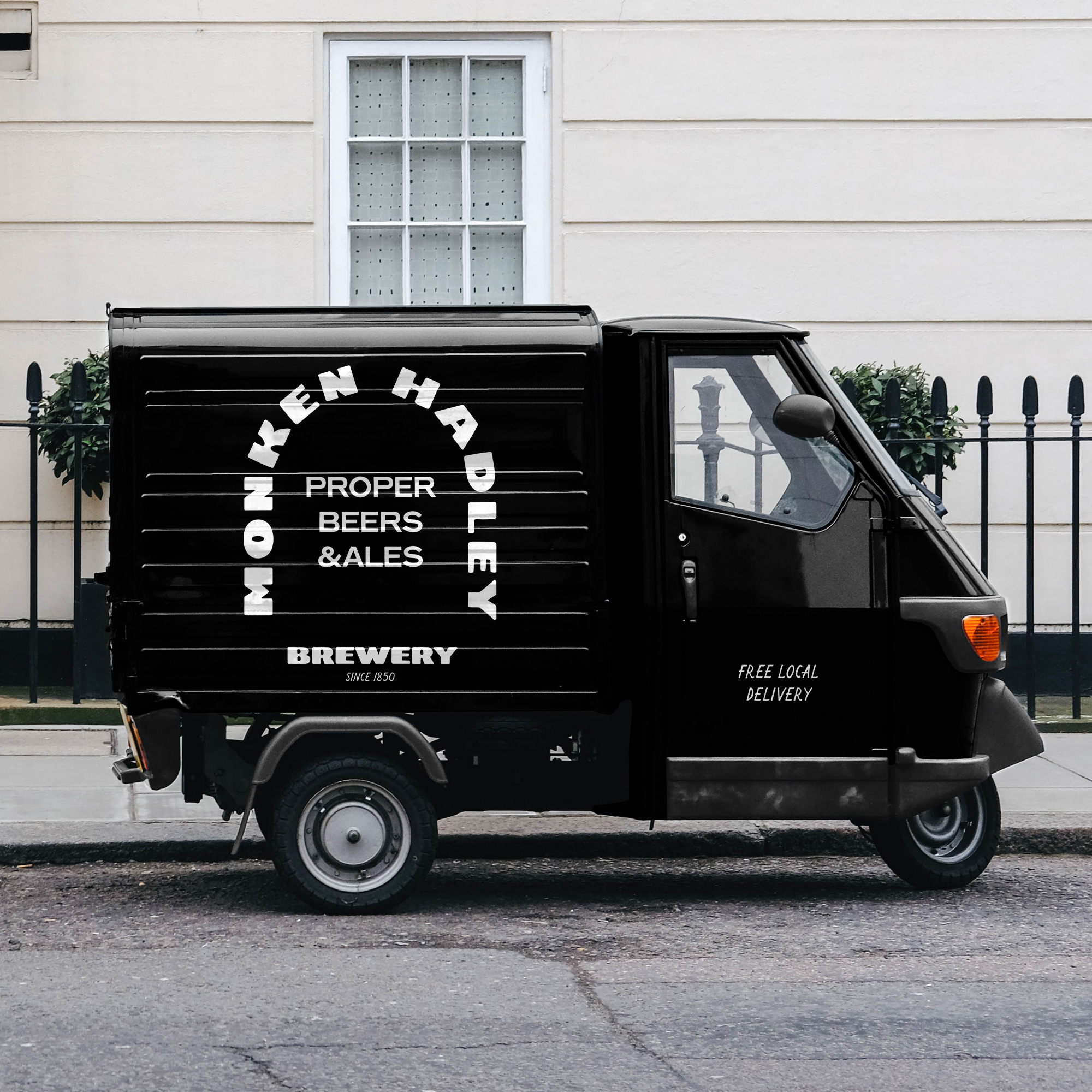
This contemporary packaging suite for the historic Hadley Wood brewery in North London combines modern typographic elements with illustrated organic shapes. Drawing inspiration from the iconic spaces and listed buildings of the area.
This contemporary packaging suite for the historic Hadley Wood brewery in North London combines modern typographic elements with illustrated organic shapes. Drawing inspiration from the iconic spaces and listed buildings of the area.
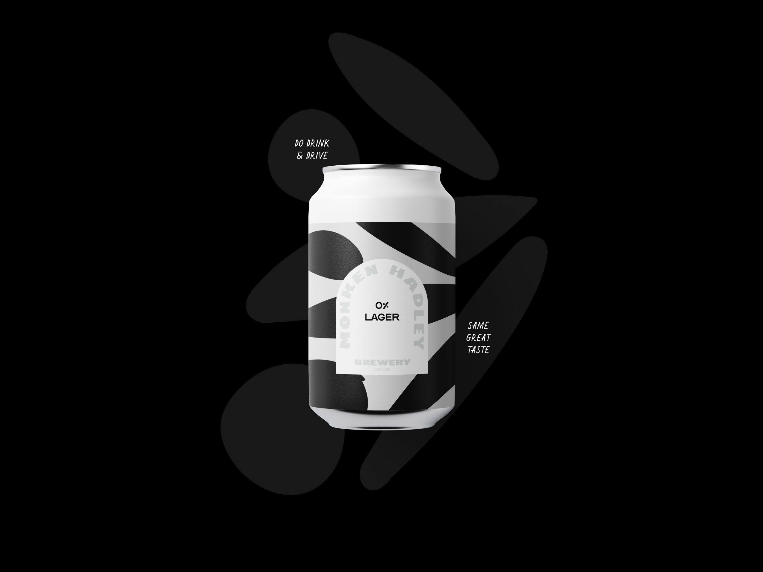
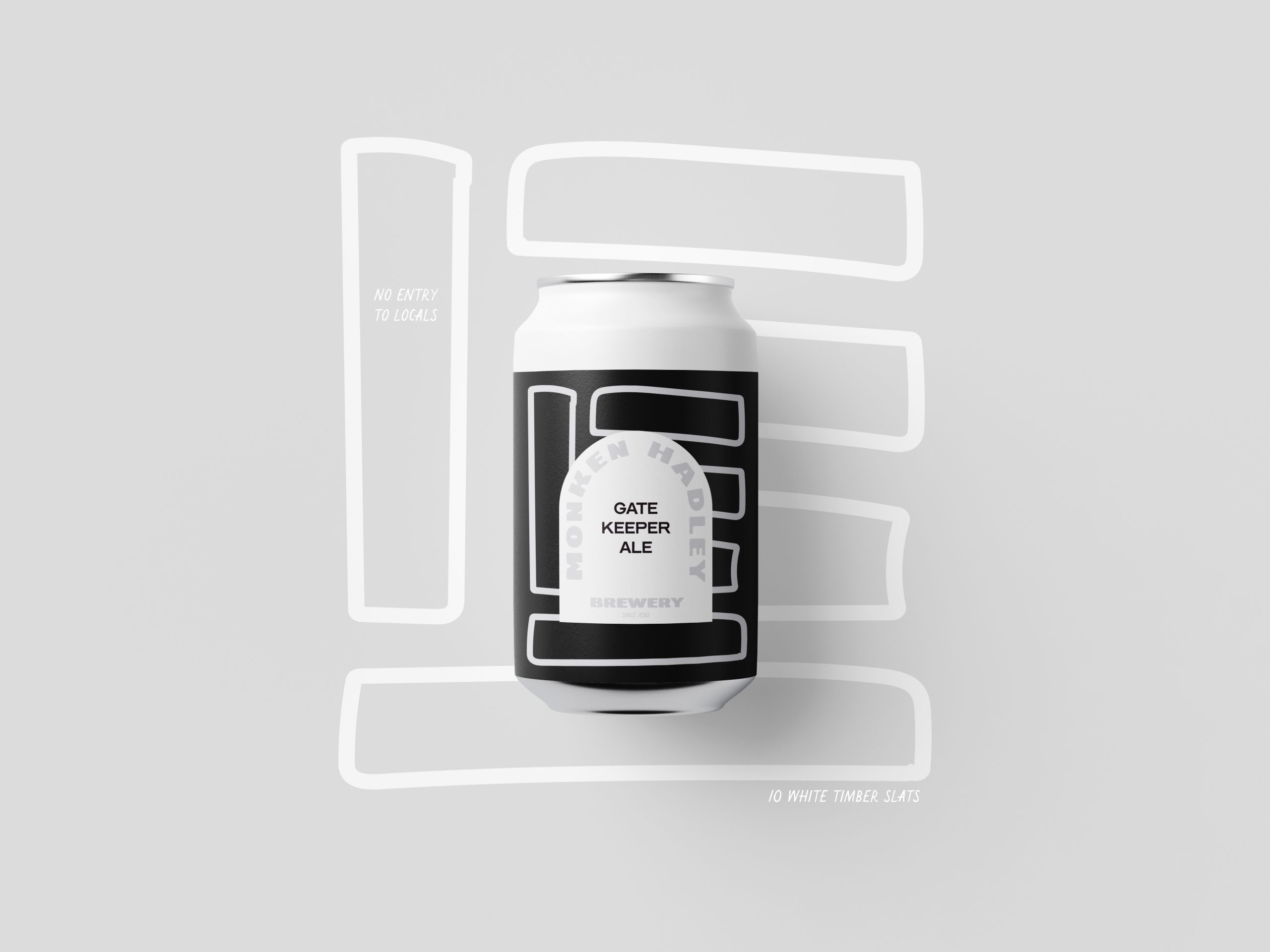
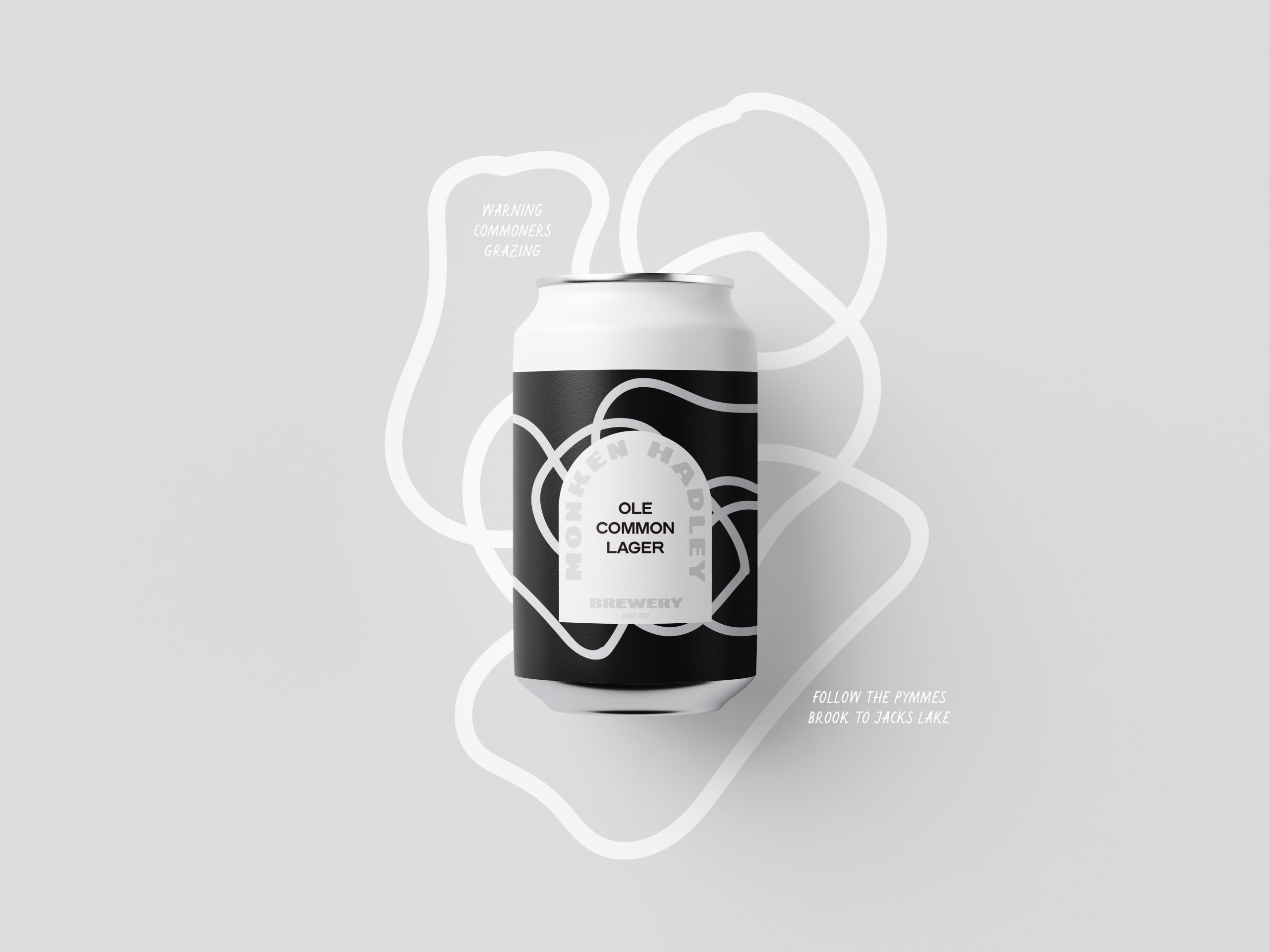
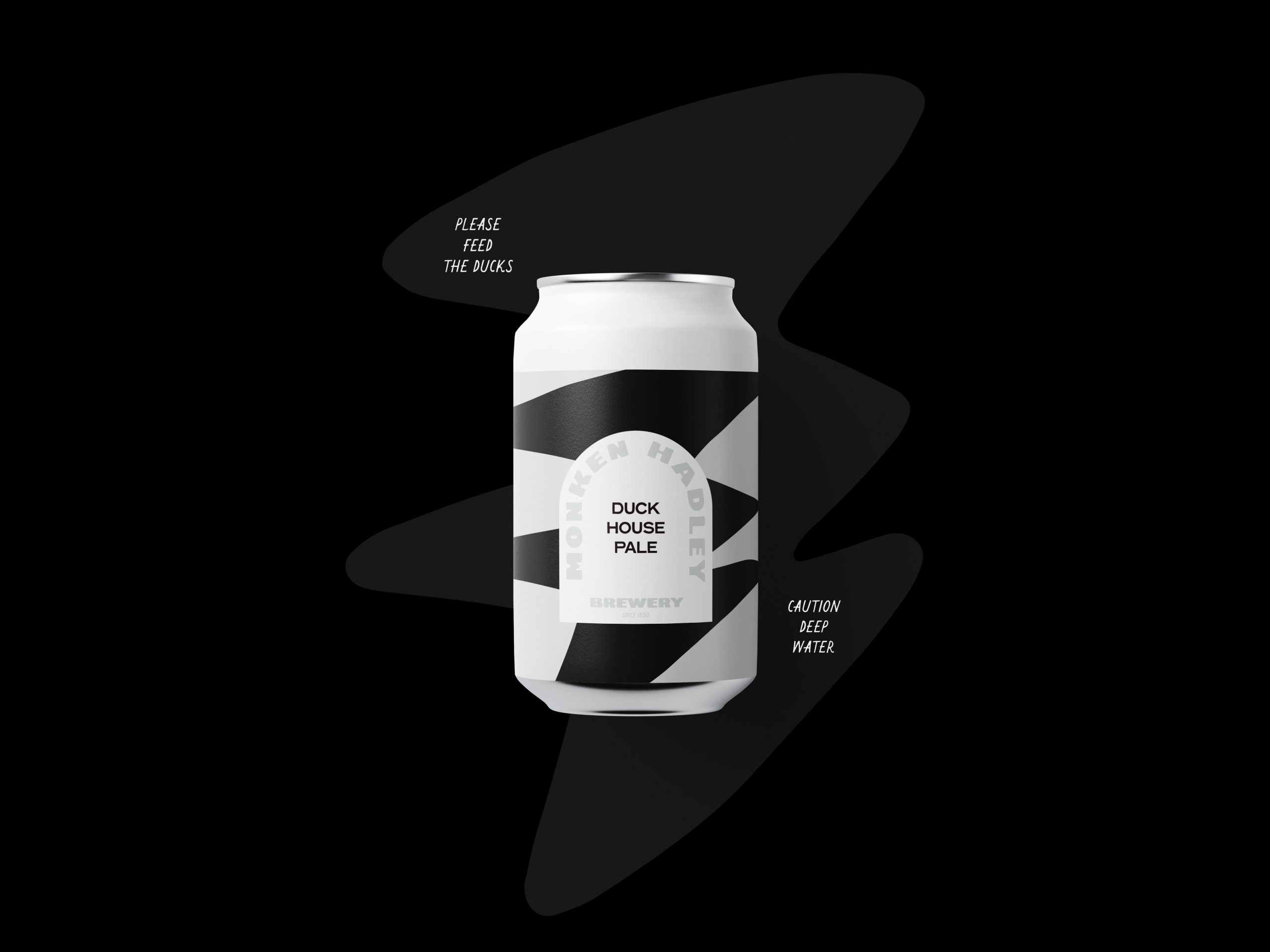
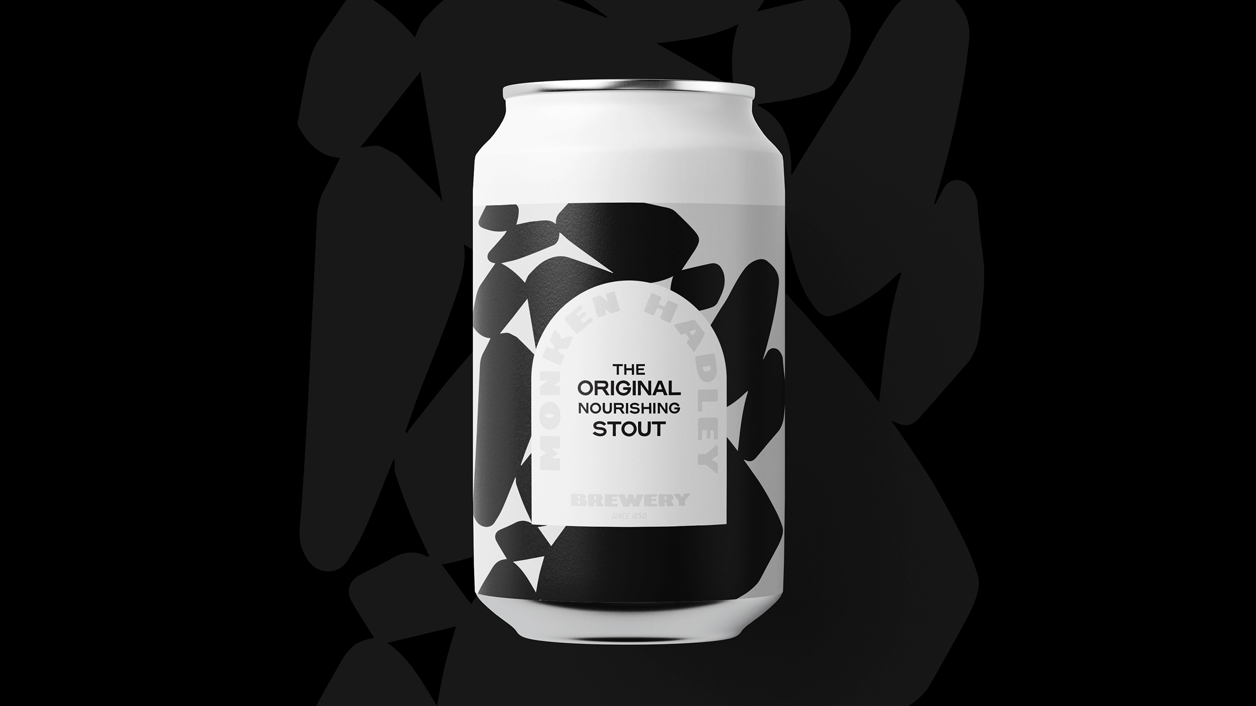
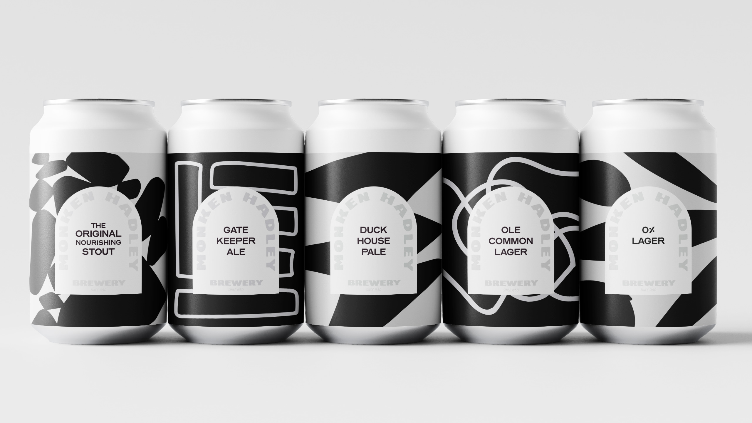
The monotone brand language creates a striking brand identity fit for an over-crowded, over-saturated market. Whilst the curves of the typography and supporting graphics soften the aesthetic - bringing a playful, energetic vibe to the products. The "archway" logo-mark signifies an entrance or portal and invites the consumer into the abstracted world of the brand. A flexible typography system allows for the product name or location to be included within the lockup.
The goal was to create an eclectic brand identity that encompasses the idea of heritage; taking influence from existing dreamland ephemera to create a timeless logo with a modern twist. A balanced word-mark allows space for the the brand to grow, a matching set of colourful brand assets give the scope to translate the unique offerings of the park across all formats.
The monotone brand language creates a striking brand identity fit for an over-crowded, over-saturated market. Whilst the curves of the typography and supporting graphics soften the aesthetic - bringing a playful, energetic vibe to the products. The "archway" logo-mark signifies an entrance or portal and invites the consumer into the abstracted world of the brand. A flexible typography system allows for the product name or location to be included within the lockup.
The monotone brand language creates a striking brand identity fit for an over-crowded, over-saturated market. Whilst the curves of the typography and supporting graphics soften the aesthetic - bringing a playful, energetic vibe to the products. The "archway" logo-mark signifies an entrance or portal and invites the consumer into the abstracted world of the brand. A flexible typography system allows for the product name or location to be included within the lockup.
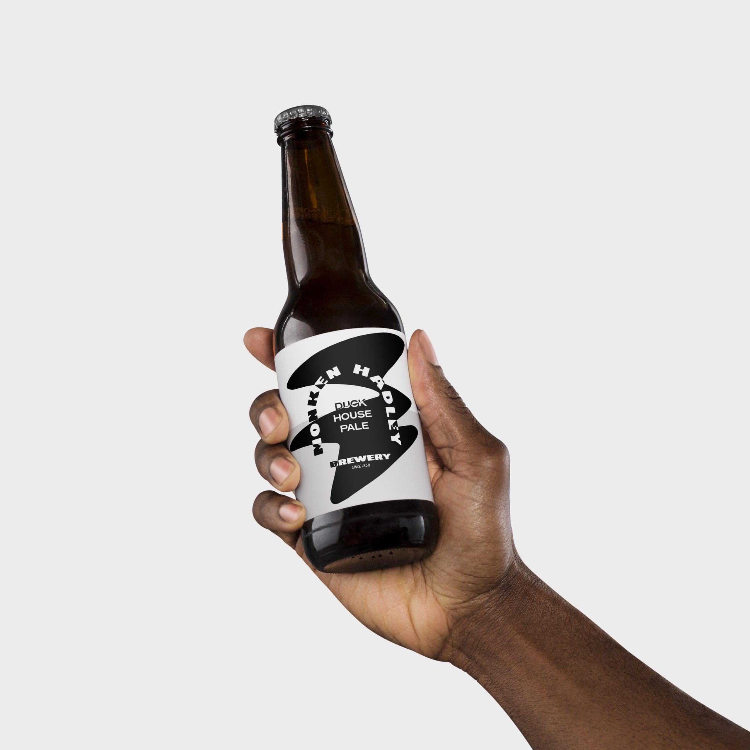
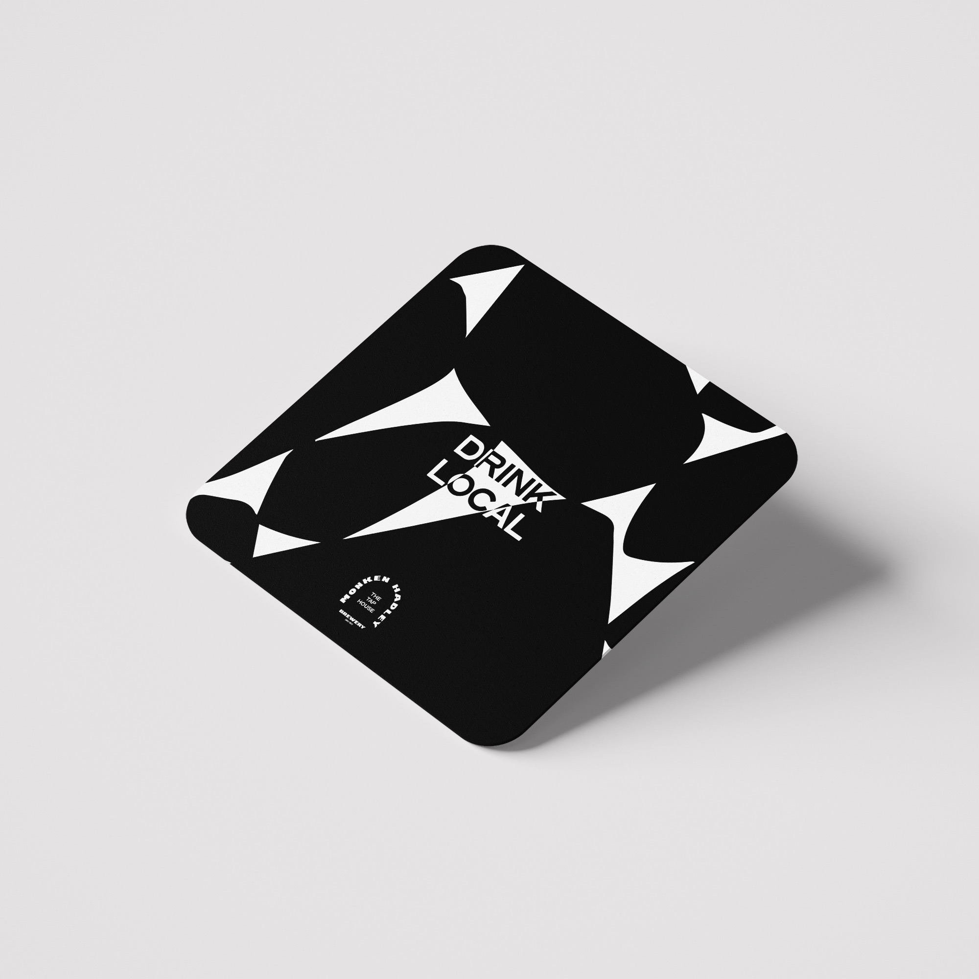

The ergonomic shapes span all outputs across the brand identity and packaging, creating dynamic intersections that frame each product. Shapes which themselves mirror local spaces: a duck pond, an original white gate, a crumbled wall dating back centuries. The otherwise mundane historical landmarks tie the brewery to its sleepy setting and its origination in the 1700s and registration in 1850. The previous brewery foremen's names scatter the packaging to pay homage to the rich history of the company.
The ergonomic shapes span all outputs across the brand identity and packaging, creating dynamic intersections that frame each product. Shapes which themselves mirror local spaces: a duck pond, an original white gate, a crumbled wall dating back centuries. The otherwise mundane historical landmarks tie the brewery to its sleepy setting and its origination in the 1700s and registration in 1850. The previous brewery foremen's names scatter the packaging to pay homage to the rich history of the company.
The ergonomic shapes span all outputs across the brand identity and packaging, creating dynamic intersections that frame each product. Shapes which themselves mirror local spaces: a duck pond, an original white gate, a crumbled wall dating back centuries. The otherwise mundane historical landmarks tie the brewery to its sleepy setting and its origination in the 1700s and registration in 1850. The previous brewery foremen's names scatter the packaging to pay homage to the rich history of the company.